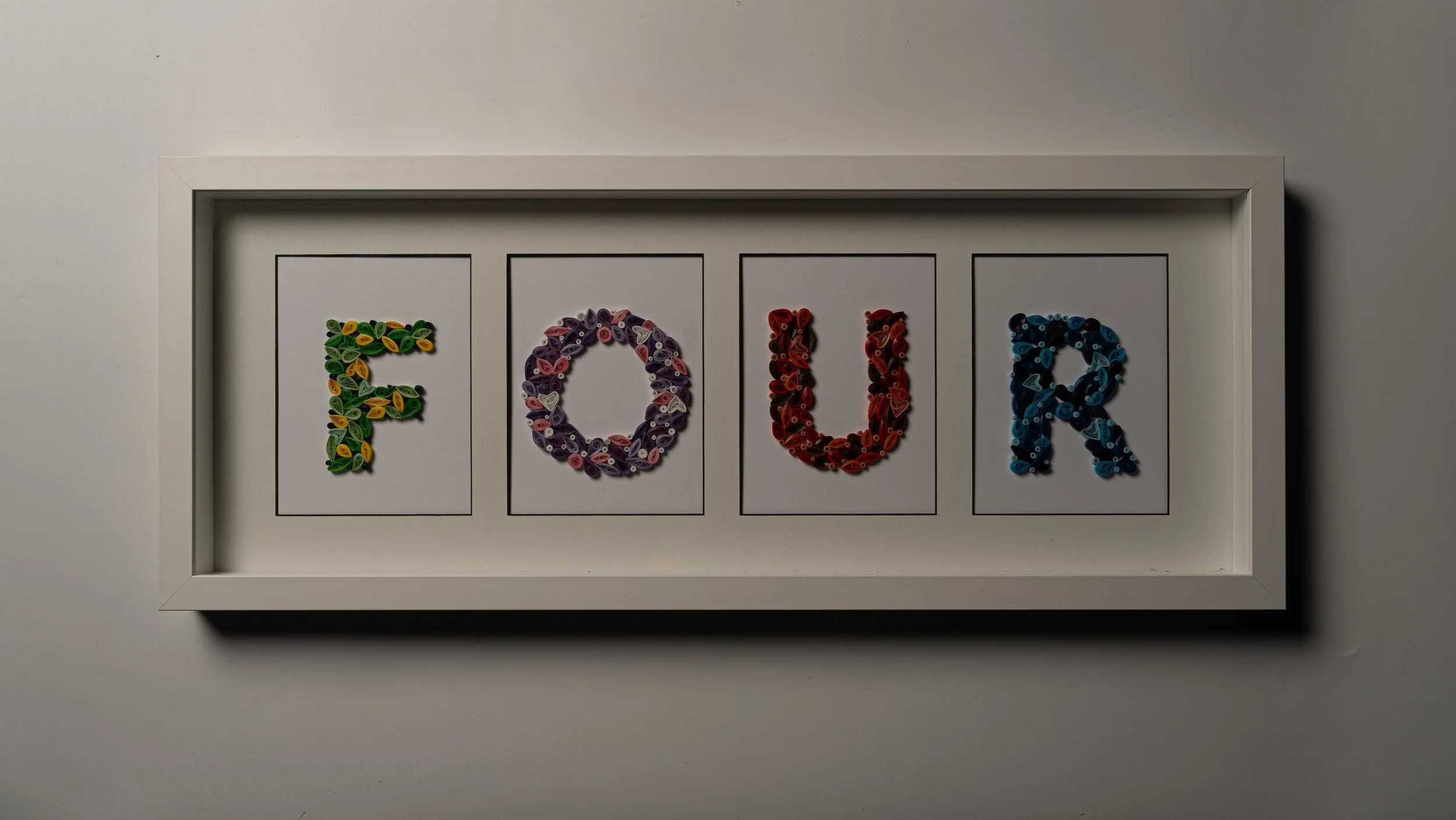
FOUR
A Typography Project Inspired by the Seasons
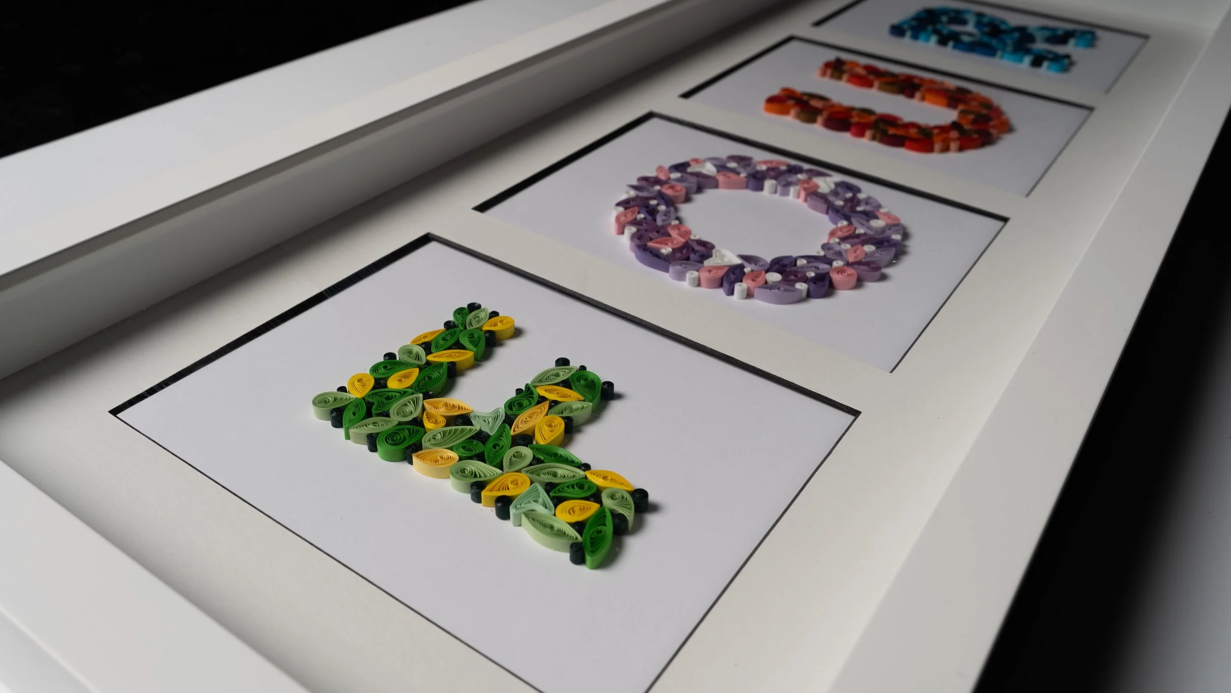
The goal of this project was to design a unique typeface from scratch, exploring both form and material. I chose to craft my letters entirely from paper, embracing the tactile quality and versatility of the medium.
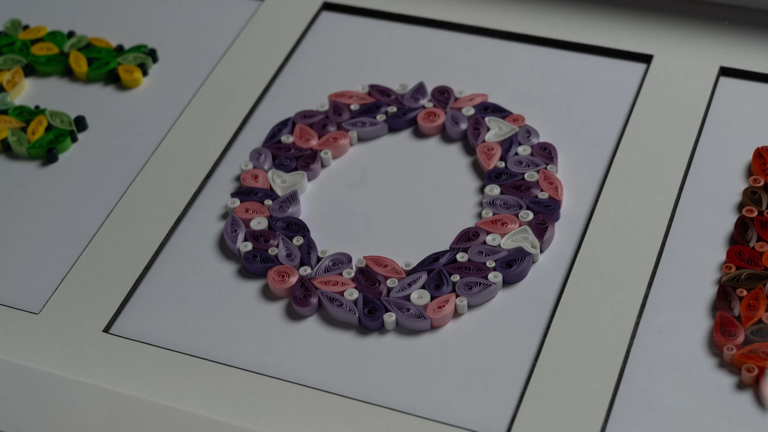
My work consists of four distinct letters—F, O, U, and R—each representing one of the four seasons:
F for Spring – Fresh, vibrant, and full of renewal.
O for Summer – Bright, warm, and full of energy.
U for Autumn – Earthy, rich, and deeply textured.
R for Winter – Cool, crisp, and minimalistic.
Each letter is designed with a unique color palette that embodies the mood and essence of its respective season. Through this project, I aimed to merge typography and visual storytelling, creating a connection between design, nature, and time.